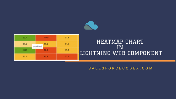
Most of time clients want to show complex data as tabular chart with different color combination. We can use HeatMap chart in LWC to show relationship within two factors like show day wise sale of top employees, day wise stock index, sport players performance for each game etc.
Let us create HeatMap chart for visualizing sales data for each employee per day. For creating this chart in LWC (Lightning Web Component) we have to perform below steps
- Download and Add Chart Library to Static Resource
- Create Apex Class to prepare data
- Create LWC Component
- Test Chart
1. Download and Add Chart Library to Static Resource
We have many JS library which support HeatMap chart like ApexChart, AnyChart, FusionChart, ChartIO, HighChart. We can use any library to generate heatmap chart.
For this post, I have used HighChart library. Download HighChart library form this url. After downloading, only add heatmap.js and highcharts.js in static resource. You can put name like chart and heatchart. If you want to change name then update name in LWC js code as well.
2. Create Apex Class to prepare data
To visualize data in HeatMap chart, we need data in X axis and Y axis. In X axis we can add employee and Y axis we can show sales count. For this post, I have used one custom object Product Sale to store data. Below fields are created in this object
| Field Label | Field API | Data Type |
|---|---|---|
| Employee Name | EmployeeName__c | Text-255 |
| Sales Date | SalesDate__c | Date |
| Quantity Sold | Quantity__c | Integer |
| Product | Product__c | Text-255 |
You can use similar object which can show data in tabular format. Now we have to use aggregate query to get sum of quantity sold by employee on each days. Below query will get sale count based non employee for each day based on input provided for 1 week.
SELECT EmployeeName__c EmpName,SalesDate__c, Sum(Quantity__c) SaleCount FROM ProductSale__c  where SalesDate__c>=:startDt and SalesDate__c<=:endDt
group by SalesDate__c,EmployeeName__c order by SalesDate__c,EmployeeName__c
Based on response we have to pass data to LWC for each employee and their sales record.
Apex Code:
3. Create LWC Component
We have data from Apex to show as Heat Map chart. To create heat map chart, we need data in specific format. We need employee name in x axis, Sales count in y axis. So we have to create data in format like [x,y,count]..
for (const it of item.Sales) {
     var s = [];
     s=[...s,it.X,it.Y,it.SaleCount];
     sale.push(s);
}
Above code will create data for chart in [x,y,count] format. Heat map will be shown in div container so one div element is require in html. This chart will show tooltip, legend and color can be changed using colorAxis json object in below component js code.
Complete LWC Code:


2 Comments
Very cool stuff… going to try out this component!
Thank You, Tigh.