Multi Select lookup or pick list selector is one of the important components in the Salesforce Application. We have a Lookup and Multi Select Pick list component in Screen Flow that will support multi-selection but for selecting multiple options we have to search again and then pick an option. For an end user, this could be a problem for multi-option selection. In this post, we will create a generic multi-select lookup component that can be used in a flow, other lightning web component, or lightning app builder page.
The component will also support showing additional 2 fields in choice. These additional fields are optional.
Check our other blog Multi Select Lookup in Screen Flow for standard multi-select lookup.
Steps for creating a generic multi-select lookup component
- Creating Apex Class for Lookup
- Creating Generic LWC for Multi-Select Lookup Component
- Test Component in Flow
- Test Component in Another LWC
1. Creating Apex Class for Lookup
Let us create an apex class that will search based on input criteria. We will create a searchRecords method which will require data in SearchRequest data wrapper. This wrapper has below properties
| Property | Description |
|---|---|
| searchKey | input text for searching records in object {objectName}. This will be searched as like in {titleFieldName} field. |
| objectName | Object API for lookup |
| titleFieldName | Field API for options |
| subTitleFieldName | Field API for options. This will be shown as additional field information like SalesforceCodex(salesforcecodex.com) |
| subTitle2FieldName | Field API for options. This will be shown as additional field information like SalesforceCodex(salesforcecodex.com-Dhanik Lal Sahni) |
| queryCondition | Optional Filter criteria for query records. like Active__c=true or MailingAddressState=’CA’ |
| selectedRecIds | Additional search criteria. This will be used to skip existing selected records. |
Here is apex class code for searching records based on input criteria.
The class will return result in a list of SearchResult wrapper class.
record– It will return sObject so that we can retrieve the required fields in LWC. We are not hardcoding fields so we have to return sObject. We are not returning too many fields, only fields mentioned in the input criteria are returned. This will be also required as we can get the parent field in the option as well.
recordId– It is the record id.
recordName– Name field value. You can skip parameters.
we have used dynamic query to fire query in the database as we don’t know for which object this lookup will be used.
2. Creating Generic LWC for Multi-Select Lookup Component
Let us create now LWC for generic lookup. As it will be generic, we have to get all required object detail from the caller so that we can prepare a lookup for a given object. We will create the below public properties in LWC which can be used and passed information by the caller.
| property | Property Description |
|---|---|
| labelName | It is label for lookup. Like Contact Address etc. |
| placeHolder | It is a place holder which will be shown in the search field. |
| titleFieldName | Primary field API which is required for lookup. Like Name |
| subTitleFieldName | Optional subtitle field to show in the list. It will display values like SalesforceCodex(salesforcecodex.com) |
| subTitle2FieldName | Optional Sub Title 2 field. It will display values like SalesforceCodex(salesforcecodex.com-Dhanik Lal Sahni) |
| objectApiName | Object API Name. |
| iconName | Icon name for the object. Refer SLDS icon for this. |
| lookupCondition | Optional Filter criteria for query records. like Active__c=true or MailingAddressState=’CA’ |
| selectedRecordIds | It is an output detail that is updated when options are selected/deselected. |
| removedRecordIds | Removed option ids. |
| addedRecordIds | Newly added options ids. |
Above properties will help us in creating a generic components. Important code block of this component are below
connectedCallback – On component load, it will show selected records as lightning-pill
setOptions – This will set option title. If subtitle is there then set title as title (subtitle). If subTitle and subTitle2 are there then set title as title (subTitle-subTitle2)
raiseEvent– On check box selection raise an event for the caller component with selected options
searchText– Search and display options based on input text criteria.
LWC Code
3. Test Component in Flow
We have completed the development of the generic lookup component. let us test this component in screen flow.
Add component Multi Selection Lookup (this is name of our generic component. You can change that in js-meta.xml file) on screen element and set properties for this component.
API Name – accountLookup
Add filter condition – Leave blank
Icon Name – standard:account
Label Name– Select Account
Object API Name– Account
Search Placeholder– Search Account
Selected Record Ids– Leave blank
Sub Title Field Api– PersonEmail
Sub Title2 Field Api– Leave blank
Title Field Api– Name
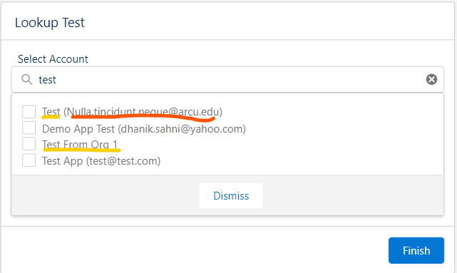
Test Lookup Image:
Yellow is our titleField and red is subTitle field.

4. Test Component in Another LWC
Let us add a generic lookup component in another LWC to test its functionality. For testing purpose, i have added one alert on checkbox selection. You can add funcationality based on your requirement.


4 Comments
Pingback: On-Demand Email-to-Case and Email-to-Case - SalesforceCodex
Pingback: Web-to-Case and Email-to-Case - SalesforceCodex
Pingback: Multi Select Lookup in Screen Flow - SalesforceCodex
Pingback: What is Salesforce Genie? - Salesforce Codex